
classic moment of the greatest film of all time. Some of my work process of working on this piece.
A rough break down where they should layout in the composition
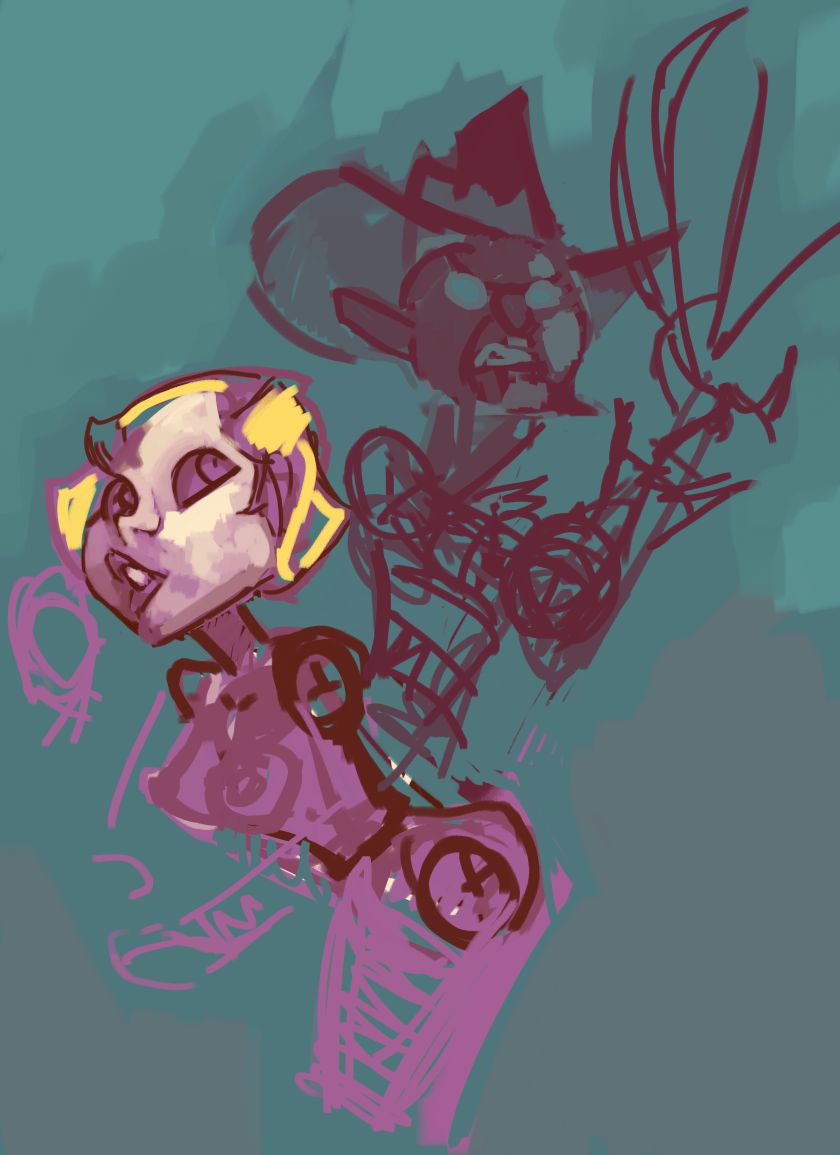
Now blocked out with simple shapes, the colors at least lay down how each of them should dynamically differ from one another

now some more broken down the shapes. Still have the round shape to freddy's face, which also helps at least tell me where the colors should be. The cloud design isn't final when designed, it's there to at least get the idea how to it should be broken down so at least I know where it should stay away from the composition.

the eyes are larger on freddy, and now the Pizza design is somewhat laid out

now the extra colors added onto freddy, helping myself seperate between the green, orange, red and pink which help seperate the face. Now more detail added onto Tina.

more detail added onto tina, the design of her is simple, kept her more wide eyed to help keep that sense of danger.

closer to finished, except the background is not finished.

a nice tight close up on Krueger's face.

4 comments:
It's awesome that it looks so painterly. The only thing I'm not sure about the blending on her face, I think you hit a better balance on your Powergirl piece. But it seems like if you smooth it out too much you'll loose the nice painted effect. Anyway dude, the rest is perfect, look forward to more!
Wait, on Freddy? or Tina?
Yeah I kinda understand what you mean, I mean the Powergirl one was more of an experiment in style change I haven't tried out yet. And I think it worked well because she's a key focal point. Here's I'm not sure because Tina isn't as much of a point more here anticipation is more of a point, Freddy is more of a key focal point.
On Tina sorry. I would say if Freddy is the main focal point you could slightly mute her colours from her legs upwards to draw the viewers eye up. Then again as a childish man I don't think that would work on me though, the girl is always the focus, everything else is sadly secondary lol.
hehe, it's okay, I've been trying hard on the tina design for a a couple months. I'm still kinda "Meh" about it. I like the eyes more, I still think the eyebrows can express more tension and suspense. Nah it's good feedback I'm really not sure about her. I'll try another stab at it
Post a Comment