Thursday, October 28, 2010

Bloody Tears

A new castlevania 3 - Dracula's Curse piece, staring Trevor Belmont, Alucard, Sypha Belnades, and Grant Danasty made for Michele Legendre's upcoming Pixel Love art show. I'm so excited to participate in this and it gives me an excuse to be a video game nerd

now a brief behind the scenes of this development.
This has been in development for a month, long time just studying crypts. But still the idea is focusing on the heroes, so I just jumped into it and immediately drew the crypt with rough idea of the heroes.

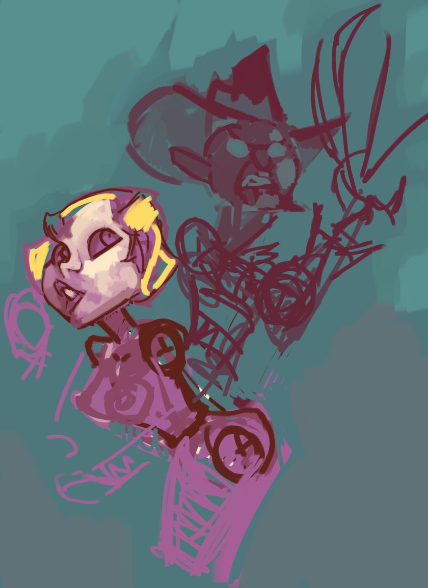
Now carving out the shape of the heroes I designed shapes of the monsters. Making them more into shadows then actual designs of individual monsters.

Now sharper designs of each monster, fallowing sprites from the game. Except for Peeping eye, which is a monster I always enjoyed. Alucard's face was something I was getting annoyed with. So I decided to redraw him on a separate sheet of paper. I deeply considered redesigning his Costume since I was basing it off of Castlevania 3, but still his design from Symphony of the night is so iconic it's hard to eliminate all of it. So I went for a sleeker design


Now some early color schemes, I always intended to wash out the contrast as they blended into the colors of the background but also showcasing their own individual color schemes.

Now the effects around each character, to help illustrate their color schemes individually.

Now focusing on the background. There has to be two or three different colors on the wall, helps give the illusion of dirt and grime but still keeping that one color sceme. Also if you notice Trevor keeps getting his face redrawn but more importantly there's now another arm, helping him get some balance in his body movement. It's always a work in progress.

That's about it, until we get to the SUPER TIGHT Detail to enjoy.


Thursday, October 21, 2010

Color study

super quick 10 minute color studies. Just doing different contrasting colors on to different skin tones.

Wednesday, October 20, 2010

Vampire Killer

Castlevania's Simon Belmont made for Michele Legendre Pixel Love show

Unlike before where I went step by step, I think there were way too many steps on this. I'll show a bit of the early work
Early on it was a super rough make

Although originally I didn't design the face as detailed, it was suppose to be super rough. Still it was a fun experence trying to go something more detailed then simple shapes.

The hair was changed to look more in motion, but also more skeletons were added. Now it's still debatable if the scene is too crowded, but still the skeletons have a simple color scheme to them. In the final design they have more color variations because they express a lot for just simple army of the damned. Still it was fun making characters for each of them even though they are all based on enemies in previous castlevania games.

Some nice tight close ups your probably going to miss on this lower resolution


Sunday, October 17, 2010

l4d characters

just going a quick study on character design using all four characters and separating each of them using shape, posture and color. Now I'm not necessarily referencing screen shots, actually using the top of my head off of my memory and key visuals I see as the game is moving.

I guess this says more about how much I play L4D

Tuesday, October 12, 2010

nightmare on elm street

Freddy vs Tina

classic moment of the greatest film of all time. Some of my work process of working on this piece.
A rough break down where they should layout in the composition

Now blocked out with simple shapes, the colors at least lay down how each of them should dynamically differ from one another

now some more broken down the shapes. Still have the round shape to freddy's face, which also helps at least tell me where the colors should be. The cloud design isn't final when designed, it's there to at least get the idea how to it should be broken down so at least I know where it should stay away from the composition.

the eyes are larger on freddy, and now the Pizza design is somewhat laid out

now the extra colors added onto freddy, helping myself seperate between the green, orange, red and pink which help seperate the face. Now more detail added onto Tina.

more detail added onto tina, the design of her is simple, kept her more wide eyed to help keep that sense of danger.

closer to finished, except the background is not finished.

a nice tight close up on Krueger's face.

Saturday, October 9, 2010

power girl gets no respect

watch what you say at comic book conventions.

dedicated to my favorite artist Amanda Conner
Thanks to working all digital I'm able to not feel too constricted with my original design. Originally this was a sketch I came out with a year and a half ago, and I'd have so much trouble redrawing it over and over again. A lot of ideas like "The fist should be more pointed out," or "maybe a more vicious laughing expression?" Any little idea I'd start from scratch but in digital I can incorporate it and go with the flow.

The head on the bald nerd, I was able to simply elongate it so you can see closer into his teeth design.

The original design made it look like Power Girl was kicking them, when instead I wanted her to come closer to them. Now there's small amounts of colors splashed into the face.

More simple colors added into the scene to help me understand how different they would be be compared with one another.

a lot more detailed added to the fanboys heads.

more and more detail added to their faces and bodies, smoothing them out. The Bald Nerd gets less of a pimple nose

A lot more smoothing out Power Girl's face, was worried about applying a thick line to the painter style.

More detail on the nerds, the hands were changed in order for there to be more of an interaction with one another. The Super Small fat hands was inspired by Tim Burton designs. And more color to Power Girl's leg that's two contrasting color values.

Now a gray background

Boots and gloves now added to Power Girl. I really wanted a nice elongated tip to power girl's boots then just pumps.

Closer to the final version, more little small detail to Power Girl, making it Sharper. The Laughters are all done in painter, I removed the comic title because I wanted to added that with cleaner fonts in photoshop.

Overall it's wonderful to get this all done and in a style I didn't expect.

Tuesday, October 5, 2010

scarifice

Bill is going to a better place

I've been working on this for a while since the last DLC "the Passing"

Monday, October 4, 2010

count yorga


1970s Robert Quarry modern day vampire film

Friday, October 1, 2010

docks


originally started as a small sketch that quickly got carried away