Saturday, July 14, 2012

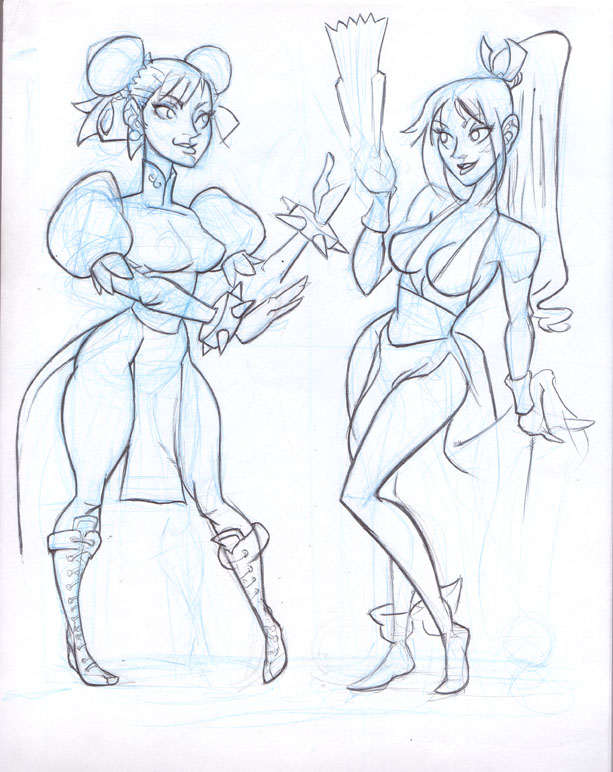
Chun Li VS Mai

I'm inspired by my friend Justin and Camilla when they draw beautiful statuesque women.
been sketching chun li all my life, so for me, it's that design of he neck, her shoulders that really stand out and become so iconic. I used Street Fighter 3 for it's more WuShu fighting style.
takes me a while working on the line work. I feel very insecure about a lot of things, Scanned it in at multiple points, in fact thought about not finishing the lines and going straight into photoshop

the color are simple, same colors on each not too different considering how mia is so influenced by chun li.


 I tend to use the same cardboard texture


without the textures


inspired by the Scott Pilgrim DVD cover, wanted to just try it out and see how it'd turn out.


I really wanted to push the shadows, to show more weight into their shape and form. It's easy to exaggerate them, but still their known for being different in their bust and thighs, so that's why I went the way I did.
This is really a gift to my friends and their inspiration.

Tuesday, July 10, 2012

TF2 conga Line

been thinking about this one since I first started playing the game. Just the typical scene of just a crew of players getting dominated by an effective spy.

sketching ideas over this piece. A nice idea of each characters own clumsily running to a sentry gun.


early on I knew this wouldn't work crammed into a simple 8x11 inch sheet of paper. I would need to draw individually each character on a sheet of paper.
so it's a mess but I could work around this


the thing is most of the tf2 characters have individual colors even if they are blue and red

here it's getting closer along

almost everyone has their own colors

a more rendered out sniper

closer to the final version but still not the right colors down, more need for blending into the background
this was a fun piece to work on. Much much much larger then I imagined, a file size of 270 mb large, and 28x8 inches large composition.

Sunday, July 8, 2012

strangelove

 Inspired by a Depeche Mode song. Love the fashion models but had to have my own humor into it.


it took me a while to get this right, so I started just trying to work the fashion model angel

and then I decided to explore myself with my cat


I have this blue color erase pencil lead so I played with that to get the right movement
I rushed in and started working in without the lines being finished and set up an early composition


I compostited  an rough using an early illustration

I rushed in and worked on it

using the music video screen cap as reference, even down to the detail of the Eiffel Tower


an experiment with how it'd look with color, just a  slight hint of it. A washed out turn of the century film


closer to the final but actually wrong font because I haven't installed the new fonts in yet
This was a fun piece to work on, it's more my sense of humor, beautiful women and cute animals. The context of the music video also helps, so I hope fans of the video get the joke.

Thursday, June 7, 2012

beautiful women studies

  just after finishing off dinner I would devote time to photoshop and do these referenced photo sketches. So why not do sketches of beautiful movie sirens.

Marilyn Monroe
 Eartha Kitt


Pam Grier
 Rita Hayworth

And this is my friend whom I babysit, we watch Chuck Jones cartoons and recite Mad Hatter quotes

Sunday, May 27, 2012

vanessa lake


pin up of the model Vanessa Lake
some nice close ups which you can't see in this re sized version
I work immediately on this digitally and here are a few step by step of my art process
a rough break downs. Not anatomically correct, had to extend out the torso. I noticed this as I worked on the arms.
simplified color layout. There's a line overlay, a bit stylized then how I enjoy it.

a texture was added temporary. Not sure if I enjoyed it, the shading on the skin was smoothed out


more attention to hair and tattoos came in . The tattoos were on a layer above, just to not mess up the skin.


more attention to the hair, eyes needed a drastic improvement, wanted that sleepy seductive look . Really took a long time to achieve that
 a texture was added in the background, opacity was turned down to 16% and layer was set to light dodge.

A very difficult piece to work on. I enjoyed working on the hair and the tattoos the most. I learned a lot through this and felt it will improve my art process.

Wednesday, May 2, 2012

Carlotta Champagne

an illustration of Carlotta Champagne
and here's a nice close up which you can't make up at this resolution
 And here's a few work in progress how I came to this piece
simple break down
not the most difficult piece, but still always checking to see if correct in proportions

added the teal color to contrast the orange and red tones in the skin.
I loved working on this piece and I'd love to do some pieces like this.