revisiting an older sketch I did about 7 years ago of an old friend Joanna.
Here's some slight images of my work process on working on this piece
simple break down, not close to the real photo, had to resize the head a lot.
started early on with grey tones help me a lot, colors are easy to get confused on the shape, so it's best to be black and white.
the color is blended into the grey tones, although not as appeal but still it works to get the job done
a lot of slapping of colors in there, the primary colors sometimes just sit there waiting to get blended in. The dress is a difficult piece, but trying to set up a flow of the fabric.
closer to the end, still always little details to update like the nose, hands, and fabric.
Showing posts with label work process. Show all posts
Thursday, July 19, 2012
Sunday, May 27, 2012
vanessa lake
pin up of the model Vanessa Lake
some nice close ups which you can't see in this re sized version
I work immediately on this digitally and here are a few step by step of my art process
a rough break downs. Not anatomically correct, had to extend out the torso. I noticed this as I worked on the arms.
simplified color layout. There's a line overlay, a bit stylized then how I enjoy it.
a texture was added temporary. Not sure if I enjoyed it, the shading on the skin was smoothed out
more attention to hair and tattoos came in . The tattoos were on a layer above, just to not mess up the skin.
more attention to the hair, eyes needed a drastic improvement, wanted that sleepy seductive look . Really took a long time to achieve that
a texture was added in the background, opacity was turned down to 16% and layer was set to light dodge.
A very difficult piece to work on. I enjoyed working on the hair and the tattoos the most. I learned a lot through this and felt it will improve my art process.
Saturday, November 19, 2011
Rydia of Mist
just finished this piece for a friend of mine's art show
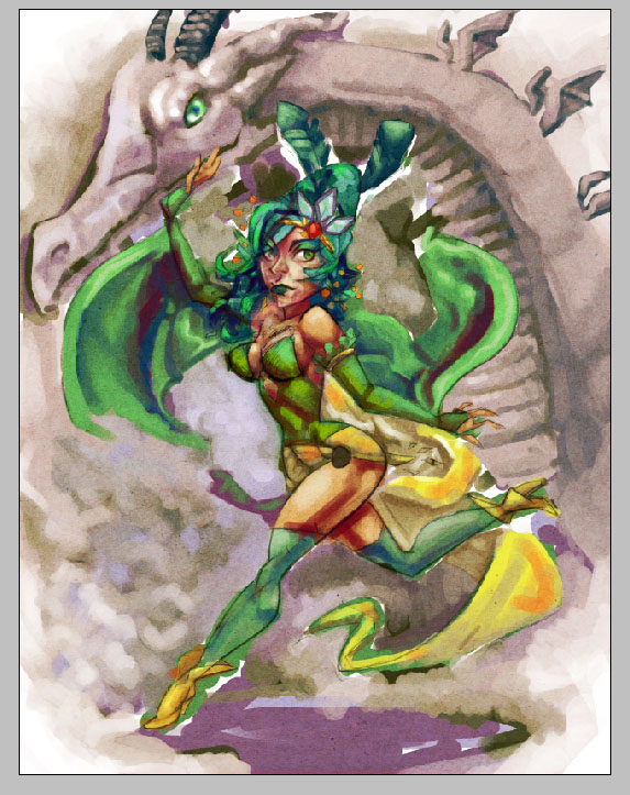
Rydia of Mist from Final Fantasy IV, a long time favorite video game character been working on it for a long time because I have high expectations of the character.
I tried referencing the DS game more then the Yoshitaka Amano art because his art is very inconsistent and hard to use as reference, even if it's beautiful and inspiring.
I won't lie I redrew her about a good 20 times, so I will spare you with every iteration, but basically I had the idea she spins around and summons a mist dragon like her mother but also her first appearance when she's older.
the line art is as close as what I want but still unhappy with her breast and her head.
But still this is a new technique I want to draw, and I'm always unhappy how my line art works and more excited to paint instead. So the lines are more mostly guideline.
I had to realign her head. It's not quite perfect, in the final version I'm still not happy with it, but I still want to have the the shoulder up close to her chin.
A new color was added into the shadows, instead of blue I added a bit of orange. I was afraid it separates the head and the body very close to one another but I do think it's interesting to have different fabrics inspired by cosplayers.
Originally I wanted to have a wing exposed to cast a shadow over her, but I don't quite think it would work if the dragon's head if lean forward so much. So I pulled it back so her hand carcasses it.
Nice detail on the jewelry and splash details were added I'm still a bit not sure about it but I'm happy the overall color of it and movement. It's an interesting piece, I might come back and either redraw it or draw her again.
Rydia of Mist from Final Fantasy IV, a long time favorite video game character been working on it for a long time because I have high expectations of the character.
I tried referencing the DS game more then the Yoshitaka Amano art because his art is very inconsistent and hard to use as reference, even if it's beautiful and inspiring.
I won't lie I redrew her about a good 20 times, so I will spare you with every iteration, but basically I had the idea she spins around and summons a mist dragon like her mother but also her first appearance when she's older.
the line art is as close as what I want but still unhappy with her breast and her head.
But still this is a new technique I want to draw, and I'm always unhappy how my line art works and more excited to paint instead. So the lines are more mostly guideline.
I had to realign her head. It's not quite perfect, in the final version I'm still not happy with it, but I still want to have the the shoulder up close to her chin.
A new color was added into the shadows, instead of blue I added a bit of orange. I was afraid it separates the head and the body very close to one another but I do think it's interesting to have different fabrics inspired by cosplayers.
Originally I wanted to have a wing exposed to cast a shadow over her, but I don't quite think it would work if the dragon's head if lean forward so much. So I pulled it back so her hand carcasses it.
Nice detail on the jewelry and splash details were added I'm still a bit not sure about it but I'm happy the overall color of it and movement. It's an interesting piece, I might come back and either redraw it or draw her again.
Labels:
dragon,
ff3,
final fantasy,
Final Fantasy IV,
rydia,
video game,
wip,
work process
Wednesday, November 9, 2011
Blue Falcon and Dynomutt
A special Birthday gift to a friend Robert Mommaerts.
Took me a while working on this
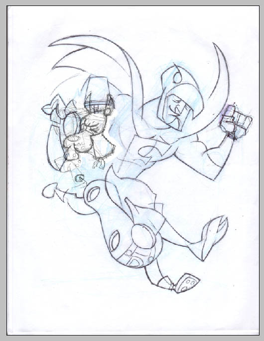
Originally I wanted to draw them on the jet, but I think you see that too often. So I went in with the running animation instead
I often like to see designs through different angles, sleeked up design
I always loved the silliness of dynomutt, so it felt in his character making silly faces. Although I still wanted a sleek design to dynomutt so I tried to make the expression very limited.
I redrew the pose over and over and over and over again. I'm never satisfied with just one design, want to see it in every angle.
You know as long as my work process goes, my pens just die by the time I get to doing the line work. So here it's not quite dead but it's close to it.
now this is a test composition using two different images. Even if I'm drawing over things with a blue pencil I often am not sure if it's correct seeing each individual object together.
I'm not happy how dynomutt head is turning out so I'd rather take in a previous drawing and clean that up instead.
Even just as a rough test, I'm curious in the middle of penciling this to just push it into the coloring process even though I'm not complete with the pencils.
And like that, just curious to see what colors are like, this is the best way to get me to push development of sketches to finished product.
A vague idea how colors look, especially how complicated it is in between the two characters
trying to see how the pipes work just going around blue falcon. it's a messy design idea but it's someone I want to see because it's the humor of the show.
Fixing up the footprints to make it easier to fallow
Playing around with colors, want to have some blending in there, it's looking nice
Drawing behind dynomutt hand and legs of blue falcon using references from a pervious drawing of blue falcon to make it easier.
Cleaning up the pipe designs, now the final version is a bit too saturated in color. I kinda regret that and might refix it, but right now it's a fun piece to work on. My art process is odd but it helps me push my work.
Originally I wanted to draw them on the jet, but I think you see that too often. So I went in with the running animation instead
I often like to see designs through different angles, sleeked up design
I always loved the silliness of dynomutt, so it felt in his character making silly faces. Although I still wanted a sleek design to dynomutt so I tried to make the expression very limited.
I redrew the pose over and over and over and over again. I'm never satisfied with just one design, want to see it in every angle.
You know as long as my work process goes, my pens just die by the time I get to doing the line work. So here it's not quite dead but it's close to it.
now this is a test composition using two different images. Even if I'm drawing over things with a blue pencil I often am not sure if it's correct seeing each individual object together.
I'm not happy how dynomutt head is turning out so I'd rather take in a previous drawing and clean that up instead.
Even just as a rough test, I'm curious in the middle of penciling this to just push it into the coloring process even though I'm not complete with the pencils.
And like that, just curious to see what colors are like, this is the best way to get me to push development of sketches to finished product.
A vague idea how colors look, especially how complicated it is in between the two characters
trying to see how the pipes work just going around blue falcon. it's a messy design idea but it's someone I want to see because it's the humor of the show.
Fixing up the footprints to make it easier to fallow
Playing around with colors, want to have some blending in there, it's looking nice
Drawing behind dynomutt hand and legs of blue falcon using references from a pervious drawing of blue falcon to make it easier.
Cleaning up the pipe designs, now the final version is a bit too saturated in color. I kinda regret that and might refix it, but right now it's a fun piece to work on. My art process is odd but it helps me push my work.
Thursday, September 22, 2011
MGS1 Pee Box
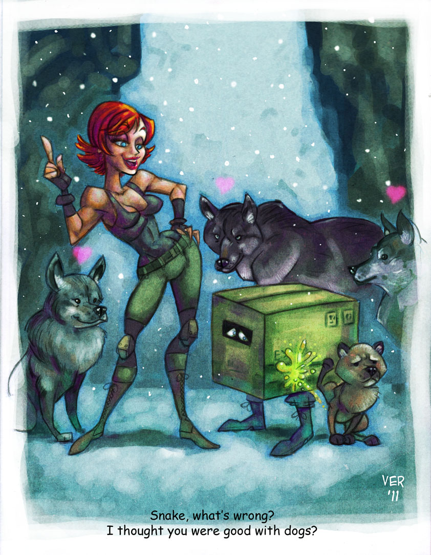
My favorite moment in Metal Gear Solid 1.
Here's a quick little tutorial video, how I do the textures.
It's a web cam, it's the best I could do. I've been kicking around this idea for a while, and of course I spend too much time sketching it out on paper well before I get into actual finished line work. Such a difficult idea, emoting little puppies, trying to nail the personality, and also I always have fear how large I draw heads. I'm very insecure how it came out, so I went into photoshop and fixed up the slips, so the chin and nose are more properly aligned. Not exactly sure how the textures should work. I want there to be a bit of Green, but also the green doesn't quite come off right with the skin makes the characters look sickly. I always had an idea this is the break down of the scene, and where exactly everything went to. and this was all temporary design of a frame. I normally make frames using water spots, but I enjoy using photoshop's generic brush tool. It was a fun piece to work on. Reminded me why I love Metal Gear in the first place. In general I usually try hard to find the momentum to push myself to finish a piece, but if you do every single step one by one. You eventually find out you don't need that momentum and the piece finishes itself on it's own. It was great practice to use Youtube and other programs to get myself motivated to finish this piece.
Labels:
illustration,
meryl silverberg,
metal gear solid,
sketches,
textures,
video,
work process
Subscribe to:
Posts (Atom)